Combining NAV-transactions with external data
In this post I will demonstrate how to easily combine NAV data with external data.
By beginning with sales data we can see sales trends by customer, by item or by geographic attribute. In addition to these attributes (we call them dimensions, and they include but are not limited to NAV dimensions) we are going to use freely available census data in an effort to identify relationships between the sales data of our products and different population densities.
Our result should look like this:

As you can see, the colors represent population density while the size of each circle represents the amount of sales. This makes it very easy to perform a quick visual comparison. By clicking on one of the bars in the chart you can filter the view to show only certain products, highlighting the relationship between amount of sales and population density for that product.
These population density groups should also be available in NAVBI Business Discovery so we can use them as a dimension to report on:

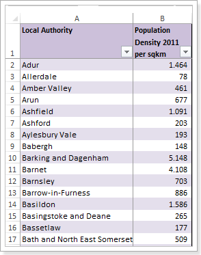
The first step is to import the data we want to work with, and since
census data does not change very frequently, we can import directly into Power Pivot. An excel-table with data from 2011 can be found here: 2011 UK Census Data (Excel)
In order to avoid importing unnecessary data, we remove columns from the table that we are not interested in.
We will do the following:
After importing the data as a linked table (see Paul te Braak - Importing Data as a Linked Table) we need to add a relationship between our existing City column (from our NAV-Transactions) and City in the census data.

Now we need to create a calculated column to identify density groups. This will establish a hierarchy of density group and city and will make reporting much easier.
A very simple grouping could be defined like:
Population Density Group:=IF([population density per km² < 1000;
"low (<1000)";
if ([population density per km²]>=1000 && [population density per km²] <2000;
"middle (>=1000 and <2000)";
"high"))
This sets the density groups, defining anything less than 1000 as low, between 1000 and 2000 as middle, and anything more than 2000 as high.
In this example we were using census data, which changes very infrequently, but what if you wanted to use data that is regularly updated? Perhaps you want to search for a correlation between the weather and your sales figures? Instead of importing the data as a linked table, you can also connect to web services or even the Microsoft Data Market.
Whether you are using static data, or data that changes every minute, I hope this post has been helpful is demonstrating how you can use NAVBI to combine different data sources in order to gain new insight into your business.